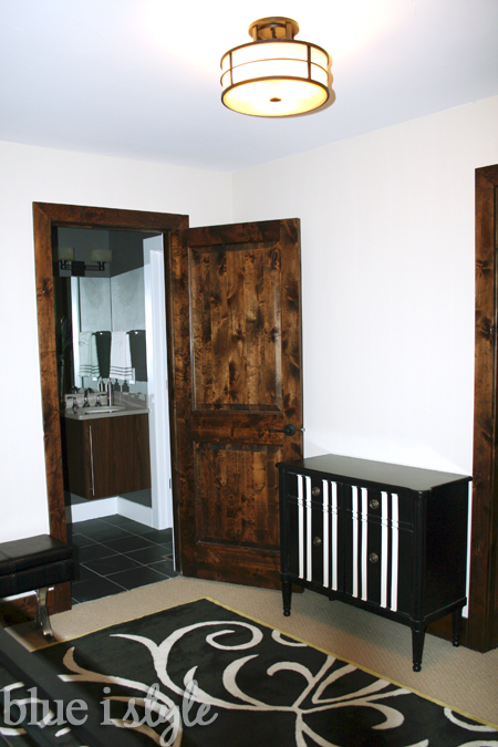
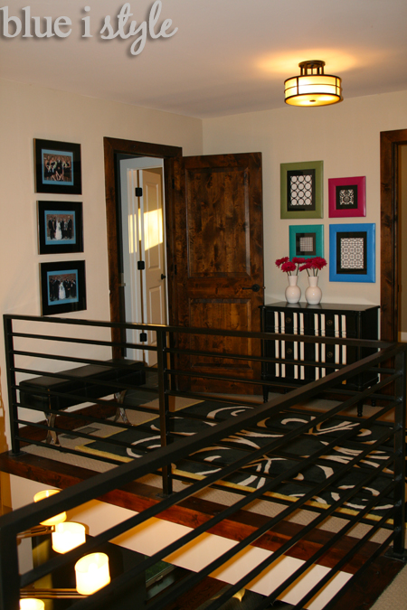
A couple of weeks ago I shared with you how we created extra bathroom storage by adding a decorative cabinet in the hallway just outside the bathroom by Beckett’s nursery. Today I wanted to talk about the artwork above that hallway cabinet.
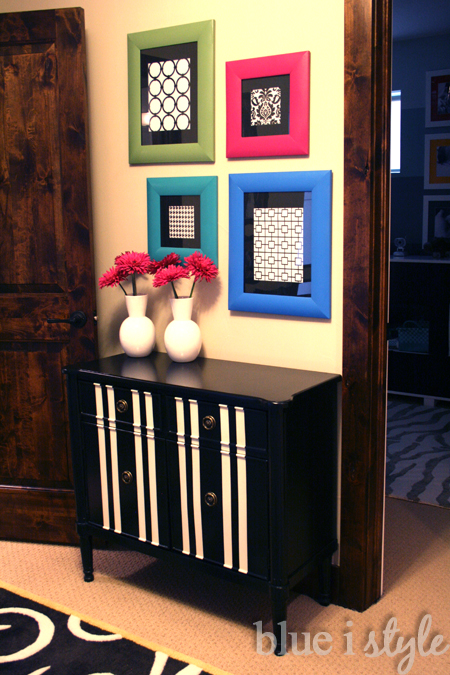
When we first bought that cute black and white striped cabinet, I struggled to decide what to hang above it. With nothing but the beige hallway walls, the cabinet looked totally lost and out of place in the hall.
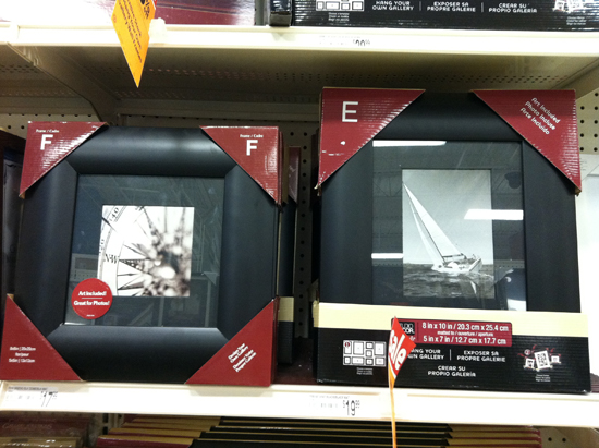
I originally thought about hanging one large piece of art, but I decided that a collage of frames might have more impact and add more interest. I hadn’t yet decided what I was going to frame, but while shopping at Michael’s one afternoon I came across some black frames with black mats that I really liked, and best of all they came in multiple sizes.
I really love the color black and tend to include it in just about every room I decorate, but even I knew that black mats and black frames above a black cabinet in a hall with a black rug might be just a bit much.
While in Washington D.C. a couple of years ago, I fell in love with the lobby of the W Hotel – which featured a striking combination of traditional and sophisticated black and white patterns mixed with unexpected pops of bold color. When I bought the black and white striped cabinet, it felt to me reminiscent of the furniture at the DC W Hotel, so I decided to continue down that road by painting the frames in bright colors.
I debated for a long time about what colors to paint the frames. Since the second floor hall is visible from the entryway below, I wanted the colors to tie in with those on the main floor – so my initial inclination was to paint them all in various shades of bright blues and greens. It was actually my husband who suggested I go more bold by painting one of the frames in a contrasting color, like red or orange. I had been wanting to add a bright pop of color in the main floor living room, so this seemed like a great opportunity to pick a color and tie it in to both spaces. I had hot pink in mind – but having always proclaimed that I didn’t like pink, I was feeling very indecisive.
I finally decided that I needed to visualize what the pop of pink would look like. So I used Photoshop to create two simple mock-ups of the cabinet with different frame color combinations – one with shades of blue and green, and one with a pink frame.

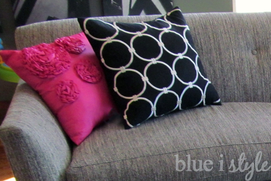
As soon as I saw the mock-ups, I was sold on the pink! I even picked up some pink pillows for the living room couch just a few days later.
I realized, however, that it was only the top two frames that would be clearly visible from the entryway below, so in order to have the pink frame tie in with the pink living room pillows, the pink frame would have to be hung on the top row. So one more mock-up and I settled on this arrangement:

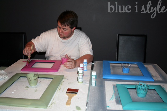
Scott, always the good sport, even helped me paint the frames. We just used basic acrylic paint from Michael’s and large, soft bristled art brushes to get a nice a smooth finish.
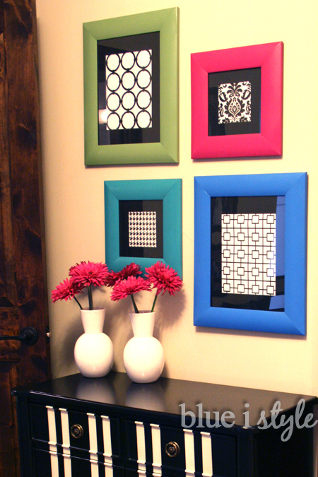
So now I had my pretty painted frames, but after so much debate about the colors, I still hadn’t decided what to put in the frames. Not wanting anything that would compete with the colors of the frames, and in keeping with the W Hotel inspiration, I decided to go with some simple graphic black and white patterns. I initially looked for scrapbook paper to frame, but after not finding exactly what I had in mind, it was back to Photoshop.
Since the pink color now tied in between the living room and the second floor hall, it occurred to me that I could make another connection by mimicking the graphic black and white pattern of the living room pillows.
Because the paper would be behind a black mat, I decided that my a paper should be the reverse of the pillow with a white background rather than black.

I also used Photoshop to create a simple Nixon pattern for another frame.

Finally, I selected two clip art images of hounds tooth and a floral for the remaining two frames.

I simply printed each pattern onto white card stock and put them in the frames. Once the frames were hung, I was thrilled with how the vibrancy of the frame colors contrasted against the simple sophistication of the black and white patterned papers.
I added two simple white vases on top of the cabinet with some bright pink gerber daisies.
Just like that the hallway went from dull and incomplete to bright and pulled together. Still on the list of projects to make this hall have more of a W Hotel feel is changing out that light fixture… I have my eye on a fixture with a black drum shade with some small crystals in the center.
Has anyone else had fun painting picture frames in bright colors? Anyone else love to use Photoshop to create simple art?

Linked up to the Be Bold Challenge at Designer Trapped In a Lawyer’s Body