This post is sponsored by Babbleboxx on behalf of Soraa.
Whether I’m designing a space for my own home or for a client, selecting colors is always where I start. Sometimes I find a piece of art or a rug that I love, and I build a decor color scheme around that, but more often, I begin by thinking about the mood I want to create in the space, and then I look for color palette inspiration.
HOW LIGHTING AFFECTS INTERIOR DESIGN
When choosing a color palette, it’s important to keep in mind how the lighting of the space will affect the color.
I have helped a lot of friends and clients choose paint colors for their homes recently, and it reinforced for me just what a big impact lighting has on color. For example, the light gray paint color that looks great in my home, which has mostly south facing windows, took on an very baby blue hue when tested in a client’s house with lots of cool, northern light.
This experience has me thinking about the challenge of picking a new color for my home office. Redesigning my office is high on the list of projects that I want to tackle in the near future, but I haven’t been able to decide on a color scheme yet.

Since my office is currently a disaster, in need of both a design and organizing overhaul, I’ve been sitting on the couch in my living room to work most days. From the couch, this is my view looking through the entry way and toward the stairs…
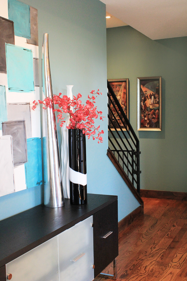
The two walls you can see in the photo are the same color, but it truly looks like they are not. The difference is because there is natural light from our two-story entry windows shining on the wall with the table and art, and no natural light at all hitting the wall at the bottom of the stairs. The blue-ish teal color of the main wall is a pretty true representation of the actual paint color in this room, while the yellowish tone of the ceiling light by the stairs makes the far wall look much more green.
Every day, I sit on the couch thinking how much more productive I’ll be when I get my office back in shape. But I also stare at this color difference get a little stressed about choosing the right colors because my office is in the basement and gets very little natural light. It will by illuminated, day and night, by ceiling lighting alone.
I have been thinking about painting my office walls a crisp white to brighten up the space and give it more of a “studio” feel, but I’ve been worried that standard LED light bulbs will end up casting a yellow glow on the walls, which is definitely not the look I’m going for. We’ve tested cool white “daylight” bulbs in our house in the past, but we’ve found that they are a bit too far on the blue end of the spectrum and give the house a glow that reminds me of a commercial space or hospital. So I don’t think these bulbs would give me the look I want in my home office, either.
I’ve been looking for alternatives to the warm white / cool white lighting dilemma, and recently learned a new term – “full spectrum color.” Soraa Radiant LED is uniquely designed with full spectrum technology that accurately replicates every color in the spectrum. Other LED bulbs have “color gaps,” but Soraa’s bulbs are designed to make colors look the same as in natural light, the way they were meant to be seen.
Isn’t that what we all want?! To decorate with our favorite colors and have the colors look inside our home they same way they would in natural light. Since I’ve been concerned about lighting my basement home office, I decided to try out the Soraa Radiant LED technology in my basement family room to see how it would impact the colors in a space with equally little natural light.
I knew it would be easiest to see the impact if I could compare the colors in the room side by side under standard LED lights and the full spectrum Soraa LEDs. I set my camera up on a tripod and took a photo of our basement fireplace before swapping out the light bulbs, and then again after installing the Soraa bulbs. These are the unedited photos that I took…
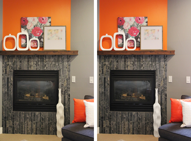
The change in the lighting is definitely noticeable in the basement in person, but might be a bit harder to identify in these photos at first glance. It’s easiest to see the difference when you zoom in and look at specific elements of the space. The whites are more pure, and the orange, pink, and red tones are more vibrant and true.

Depending on the size of your computer screen, it might help to zoom out just a bit. Scroll until you can see both pink photos on the screen at the same time, and then so you can see the bottom of the white mats of the framed photo on the screen at the same time.
While the difference is easier to see in my photos when you zoom in, the impact in the space is amplified when it’s all around you. I finally feel free to paint the walls of my office white, knowing that the Soraa bulbs will give me the true white I’m craving, without unwanted yellow or blue tones.
How to Choose a Color Scheme
Since I’m a color lover, white office walls won’t mean that I’m creating a neutral color scheme. Instead, I envision the white being a backdrop to let my love of color go wild. I feel confident knowing that Soraa’s full spectrum technology will bring out the vibrant colors in whatever art, rug, and accessories I choose. This will help me create the cheerful space I’m dreaming of, and make me happier in my new office despite its basement location with little natural light.
Ok, so now that I’m ready to let my love of color run free… how will I select the colors for my office?
I sometimes get stuck thinking of the same color combos over and over, either because I’ve used them before, or because they are trendy and on display in every store. Fortunately, fresh color inspiration is everywhere – in art, in nature, and even in urban landscapes.
One of my favorite ways to think beyond current color trends is to draw color inspiration from some of my favorite travel photos. I’ve created some sample color palettes that I’m considering, and I hope some of these may inspire you, as well!
COLOR PALETTE INSPIRATION: Blue Domes of Santorini

COLOR PALETTE INSPIRATION: Cape Town Bo Kaap District

COLOR PALETTE INSPIRATION: South African Winelands

COLOR PALETTE INSPIRATION: Beverly Hills

COLOR PALETTE INSPIRATION: Alhambra Tile

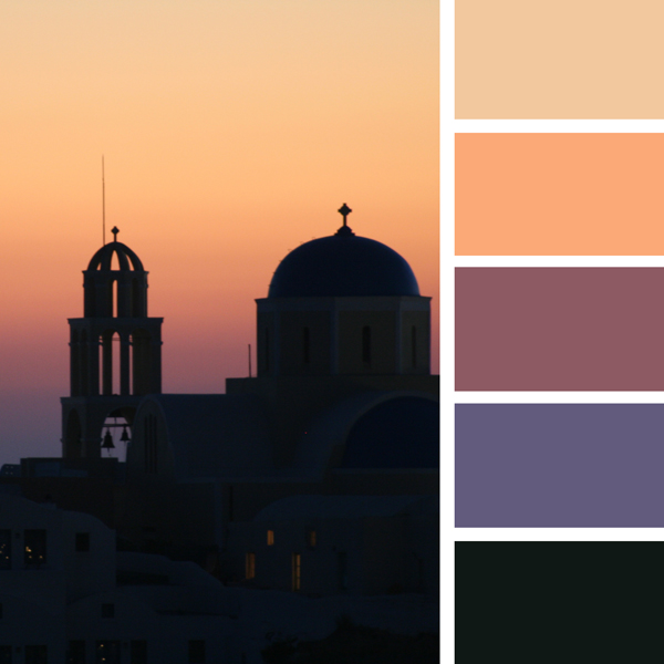
COLOR PALETTE INSPIRATION: Greek Sunset

COLOR PALETTE INSPIRATION: Granada, Spain

COLOR PALETTE INSPIRATION: Pink House

Which color palette do you like best? Are there any of these you would consider using to create a color palette for you own home?